
The Calibri typeface, emblematic of word processing software for over a decade, is about to give way. This transition marks a significant turning point in the world of digital typography. Let’s take a look at the options available to users to replace Calibri, and the implications of this change.
The evolution of default fonts in office suites
Since 2007, Calibri has reigned supreme on documents created with the most popular office software. This sans-serif font has established itself as a standard, replacing the venerable Times New Roman. However, after 15 years of loyal service, it’s time for a change.
The importance of the default font cannot be underestimated. It’s the font that automatically appears when a new document is opened, influencing the appearance of millions of texts worldwide. The choice of this font reflects not only aesthetic considerations, but also the spirit of an era. If Calibri is associated with the 2000s, its replacement should embody the era of the 2020s.
The transition to a new font will take place gradually over the coming months. Nonetheless, users attached to Calibri will be able to continue using it, as it will remain available in the list of proposed fonts.
What are the alternatives to Calibri?
In its quest to find a worthy successor to Calibri, the IT giant has ordered five new sans-serif fonts. Each has its own unique characteristics:
- Tenorite: a modern font with geometric shapes
- Bierstadt: inspired by Swiss fonts, precise and functional
- Skeena: a humanist font with subtle variations in stroke thickness
- Seaford: designed for high legibility, even at small sizes
- Grandview: optimized for on-screen reading, with simple, uncluttered shapes
In a spirit of innovation, the company solicited feedback from users via social networks to choose the new default font. This participative approach enabled the public’s preferences to be taken into account in the selection process.
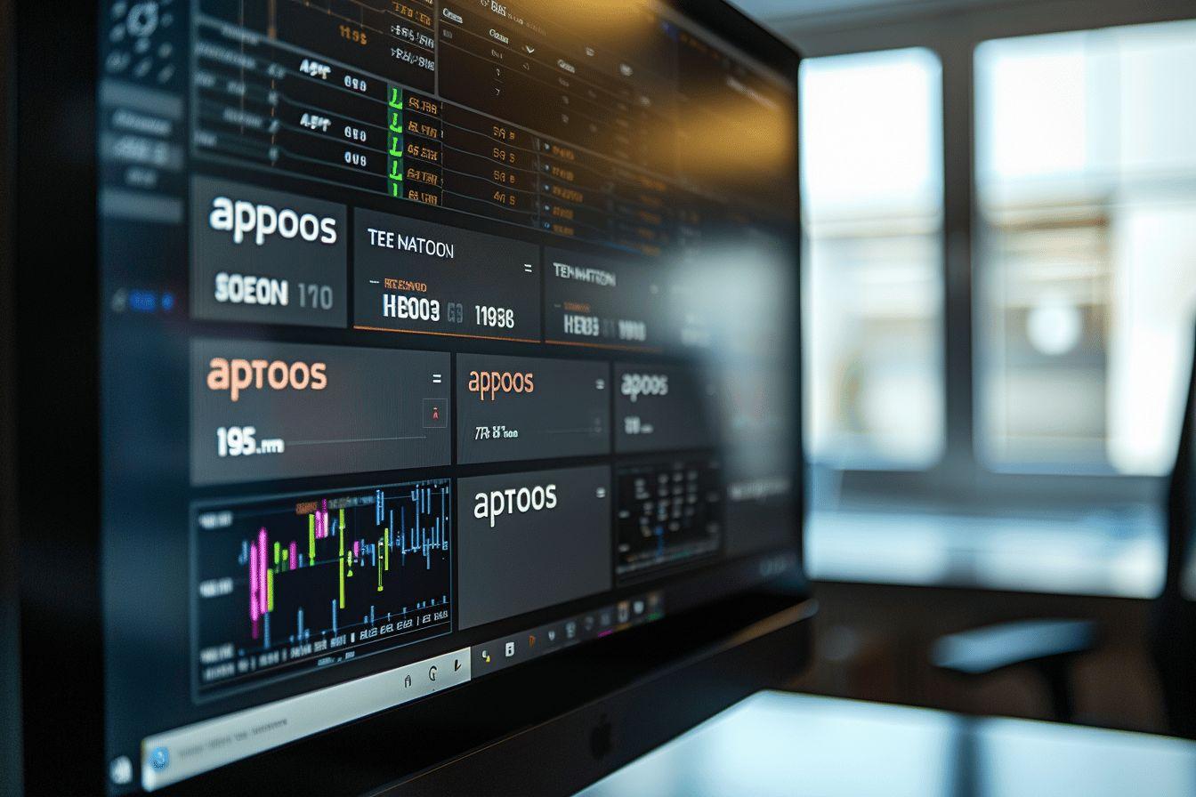
However, against all odds, it was a sixth font, named Aptos, that was finally chosen. Created by talented designer Steve Matteson, Aptos stands out for its clean, modern design, with sharper finishes particularly suited to today’s high-resolution screens.
| Features | Calibri | Aptos |
|---|---|---|
| Style | Sans serif, rounded | Sans serif, sleek |
| Screen adaptation | Good | Excellent |
| Universal | Versatile | Very versatile |
| Reading comfort | High | To be confirmed in the long term |
The challenges of changing default fonts
The switch from Calibri to Aptos raises several important issues for word processing software users. The new font is intended to be more neutral and universal, capable of adapting to all situations. This versatility is crucial in a world where documents are consulted on a multitude of media, from smartphones to 4K screens.
Aptos is in line with the minimalist trend adopted by many technology companies. Its simple, uncluttered graphic style aims to enhance legibility while offering a contemporary aesthetic. However, some experts have reservations about the reading comfort of Aptos for long texts, compared with Calibri.
The choice of a default font has implications that go beyond mere aesthetics. In 2017, the “Fontgate” affair in Pakistan demonstrated the unsuspected importance that a typeface can have. Backdated official documents had been discovered thanks to the use of Calibri before its official release, bringing to light an attempt at fraud.
Adapt your typographic habits
Faced with this change, users will have to adapt and potentially revise their typographic preferences. Here are a few tips to help you make the transition:
- Test different fonts: Don’t hesitate to try out Aptos and the other alternatives on offer to find the one that best suits your needs.
- Consider the context of use: Choose a font adapted to the reading medium (screen, print) and the type of document (report, presentation, etc.).
- Ensure consistency: In existing documents, check that changing the default font does not affect the page layout.
- Remain open to change: New fonts can offer unsuspected advantages in terms of legibility and aesthetics.
It’s worth pointing out that changing the default font doesn’t mean Calibri is obsolete. Calibri remains a viable option for those who are attached to it or find it particularly suited to their needs.
Digital typography continues to evolve, reflecting technological advances and changes in our reading habits. The switch from Calibri to Aptos marks a new stage in this evolution, promising an enhanced reading experience for users worldwide.
Whether we welcome this change with enthusiasm or with a certain nostalgia, it’s undeniable that font choice plays a crucial role in our daily interaction with digital text. As we adapt to this new typographic era, it will be interesting to observe how Aptos and its contemporaries will shape the appearance of our documents in the years to come.